
Website design requires a certain art. For effective design, companies need to balance functionality and information while still attracting customers.
Poorly designed sites, on the other hand, only scare customers off. Difficult user experience will encourage people to leave before they get the chance to learn about your company. In fact, 75% of internet users will judge a website’s credibility based on their looks alone.
Don’t let your design hurt your ROI.
Instead, keep reading to discover the 10 web design mistakes small businesses to make. If your website is suffering from these mistakes, it could be time for an update.

1. So Much Clutter
Stuffing your website with content isn’t going to help you make a sale.
Poorly designed are often cluttered with content. Too many people try to cram as much information as possible above the fold. Unfortunately, this can cause a strain on the eyes.
Flashy designs don’t look good on smaller mobile devices, either.
Plus, trying to load heavy images from the get-go can cause a lag. Most people don’t wait around for a website to load longer than a few seconds.
With too much going on, you could lose visitors.
Instead, it’s important to focus your content. Determine what your customers need to know. Then, keep it clean with the right balance of text and imagery.
Here are a few ways good design can help your business. Click here and find out.
2. Not Enough to Look At
While it’s important not to clutter a page, a blank page doesn’t help, either.
Minimalist design is great, but you still need to focus on functionality. Leaving too much to the imagination can leave your site visitors wondering. If they don’t understand the purpose of your content, they’ll leave.
Try to give each website page a purpose.
Keep that purpose in mind when you add images, text, headers, and call-to-action (CTA) buttons.
3. Mass Confusion
Branding your website is important. The right color palette, images, and voice can make it easier for people to recognize your brand. These elements should remain consistent across multiple marketing channels, too.
For example, if someone sees these brand elements on your social media account, they should see the same brand.
Poorly designed neglect branding.
Imagine someone clicking from one site page to the next. Does it look like they’re on a completely different website? This lack of consistency can confuse your visitors.
In fact, many will choose to leave.
4. Weak CTAs
A call-to-action encourages people to take action on your site. This can include filling out a form, making a purchase, or calling your company directly.
A strong, influential CTA can turn a website visitor into a lead or paying customer.
Make sure your CTA is clear. What action do you want people to take? Don’t get so creative with the CTA that you lose clarity.
Don’t forget to use urgency, too. Adding “now” or “today” to your CTA can give people the extra push they need to take action.
5. Where’s the Whitespace?
Remember when we talked about clutter? Poorly designed also neglect to add white space.
Let your page breathe!
White space gives a visitor’s eyes the chance to rest. The extra space can also make it easier for them to read your content. Effective use of white space will help you lead people down the page and towards your CTA.

6. Imagery & Interruptions
The images on your website should also reflect your brand.
If you’re aiming for a professional look, don’t use cartoons. Meanwhile, a website for children probably shouldn’t use pictures of professionals in suits.
Know your audience and what they expect. Then, use high-quality imagery that matches your brand.
While online videos are a great way to engage customers, make sure it’s on mute. 85% of online videos are consumed without sound. Otherwise, you run the risk of disrupting your audience and ruining the user experience.
7. No Navigation
Some of the biggest website mistakes include a complicated navigation menu or missing one altogether.
The navigation makes it easier for people to explore your site. When you’re clear about the page structure, you can also help site visitors find what they’re looking for. If they struggle to find that content, however, they may choose to leave.
Instead of frustrating your site visitors with complicated navigation, make it easy!
You can also add a search bar at the top of your website to improve user experience and functionality.

8. Terrible Targeting
As you correct these design mistakes, you need to consider your audience.
They’re the ones using your website. If the design doesn’t align with their goals and needs, you’re already behind. The way your site looks and works, on the other hand, can help you make a sale.
Don’t leave your content out-of-date, either.
Instead, offer your visitors information that’s relevant to their current interests. In addition to updating your site copy, you should also consider offering blog copy, too.
9. No Contact
How are customers supposed to reach you? Neglecting to include contact information is another common web design mistake company’s make.
Make sure you display a method for contacting you throughout your website.
That way, visitors don’t have to backtrack or search around to find the CTA.
You can also use buttons, which stand out on the page. For example, consider adding a CTA button to the top right corner of your navigation. That way, customers can find the link to your information or form on any page.
10. Non-Responsive
50% of consumers expect a mobile page to load in less than two seconds.

If your website isn’t mobile-optimized, however, you’re already failing your customers. More people are searching for sites from their phones instead of laptops. As you correct these mistakes of poorly designed sites, make sure your site is optimized.
Otherwise, you’re making it difficult for your mobile audience to interact with your site.
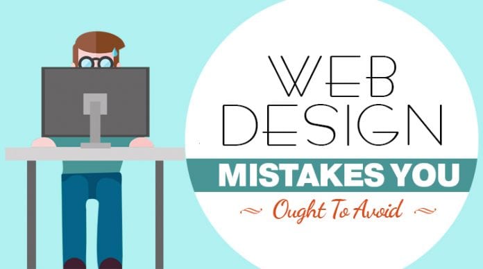
10 Mistakes of Poorly Designed Websites
Cut it out! Making these mistakes of poorly designed could cost you. Instead, update your company website with the latest design trends.
With an eye-catching design like the ones created by WSI Proven Results (https://www.wsiprovenresults.com), you can impress customers and grow your business.


