
It’s no secret that the internet is evolving. In the last decade, users have had access to the internet in ways that were unimaginable only a decade ago. Visitors increasingly use tablets, computers, gaming gadgets, watches, and mobile devices to reach your website.
So, having a mobile-friendly website (i.e., a version of your website compatible with smartphones and tablets) is critical for your company.
The mobile-friendly algorithm change, which began rolling out on April 21, 2015, enhances the ranks of mobile-friendly sites in search results.
Mobile devices account for 15% of all traffic on average, according to a Search Engine Land analysis from May 2013. According to a Yelp company report, 55% of all searches are conducted on mobile devices. Based on these data it’s reasonable to argue that mobile is vital for your company. Read more and find out.
Fortunately, if you’re a marketing manager who’s trying to convince your bosses that a mobile-friendly website is essential, don’t worry. I have put together a list of resources to help you make a case for a mobile-friendly website.
What is Responsive Web Design?

This strategy generates a site or system that adapts to the size of the user’s screen. Create a flexible and adaptive web page that is optimized for the devices that are viewing it.
Users are increasingly using mobile devices to access websites, and responsive design is the most effective means of reaching them across numerous platforms and ensuring a smooth user experience. 2013 has been labeled as “Year of Responsive Design,” and with readers increasingly preferring to read news online on different platforms (such as tablets and smartphones), responsive web design is becoming more critical.
History of Responsive Web Design
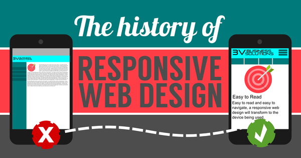
Audi.com, created in 2001, was the very first website to automatically adjust its layout to fit the size of the browser window. Designer Ethan Marcotte developed the term “responsive web design” in a 2010 article to convey the notion of fluid, adaptable, smooth, and flexible. Marcotte published a book named “Responsive Web Design” in 2011.
Essential Benefits of Responsive Web Design

Businesses that want to reach a larger audience of prospective consumers must take advantage of the benefits of flexible web design for B2B. Here are 6 benefits of responsive website design explained:
1. Boost your search engine visibility
With responsive design, you can manage one website with one set of links, saving time. This helps you to concentrate on link outreach with a unified SEO approach. Creating a responsive website allows you to concentrate all of your SEO efforts on one site, with a consistent approach and methods across devices.
Because low-level duplication of material between sites is unnecessary with responsive design, fewer resources are lost in low-level duplication of content across sites, enhancing your chances of better search engine ranking.
Also, in the fourth quarter of 2017, approximately half of all worldwide online traffic came from mobile devices. This is enormous for high street and online shops and other emerging mobile use cases.
2. Improved User Experience
A better customer experience is the result of a responsive website. The number of time users spends on your site is a good indicator of the quality of their experience. They won’t remain on your website if they have to pinch and zoom continually to browse or utilize it.
The issue is that if your website is responsive to screen size, users will easily access menus, links, buttons and fill out forms without difficulty. Consequently, they’ll have a more enjoyable stay on your site and be more likely to return.
3. Easier Maintenance
Easy website maintenance is directly related to the previous point. Your employees or development team will have to split their time and resources between two websites if you have two versions of your website. For example, with a responsive website, your employees may devote more time to marketing, A/B testing, customer support, and product or content creation rather than maintaining the site.
4. A faster loading time for the website

All devices, but notably smartphones and tablets, benefit from responsive websites. It takes less time for a website to load because of responsive images and fluid grids, which directly influence the length of your user’s stay. 53% of mobile phone users will leave a site if it takes more than 3 seconds for pages to load, according to study. Increased time being spent on the site and better conversion rates may be attributed to faster loading websites. In light of this, responsive site design is more important than ever before.
5. Increased conversion rate
You’ve only won half the fight if you can reduce your website traffic. Capturing new consumers requires providing a good user experience on all platforms. Customers do not want to be taken to device-specific websites when making a decision about whether or not to utilize a service. Users are less likely to switch to a rival if they can access a single, secure, and professional-looking website on any platform.
6. Enhancements to the online experience
Because first impressions matter so much, you want visitors to your website, whether they are using a desktop or a smartphone, to have a consistently favorable experience. Visitors are more likely to abandon a website after a single visit if they have to repeatedly zoom in, minimize their browser window, and squeeze their displays.
Bottom line

As you can see, responsive web design has several advantages for your company so planning to hire a professional website designer like redspotdesign, it is much necessary for one who’s planning to be a brand over the internet. For non-responsive websites, planning a makeover and fluid layout is a smart starting step. Your sitemap will help you decide which page components are most essential, which pages may be removed, and how much material you want to preserve.
Once you know where you want to go with your redesign, you can focus on picking the right platform and theme. Following these steps will enhance your site’s conversion rate, engagement rate, SEO, and many other factors.


